BAC Skywalk is a VR project built for Brisbane Airport Coroporation, built to explore different wayfinding options in a spatial environment.
BAC was one of the first projects I worked on at Aurecon, and it's a good one to look back on. We did some things well, we learned some lessons, and in retrospect there were some things we could have improved as well.
This article was last updated on 2020-10-06. Feel free to reach out if you're interested in hearing more, my contact details are on the homepage.
The story
Let's start from the top. BAC Skywalk started with a great client relationship with the Brisbane Airport Corporation and a new signage layout for their Skywalk. BAC wanted people being dropped off at the domestic terminal to go up and over the Skywalk instead of crossing a number of roads at ground level, to reduce traffic pressure and improve safety. As part of this, they wanted to upgrade the signage on that Skywalk to be more clear and concise. Signage was redesigned, layouts were prepared, and life was good.
However, if you've ever looked at a signage report as a non-engineer, it's not exactly easy to understand. It comes as a black-and-white plan view, with pointers pointing to ID numbers which reference images in a separate appendix. While it's easy enough to say "oh, yes, sign A13 goes here", it's harder to understand exactly what passengers will see going through the airport.
The BAC client manager, Damian Murphy, understood this well. He had a good relationship with BAC, and knew that the key stakeholders (C-suite, head of security, etc.) would value early input into the designs and a hollistic passenger level understanding. He convinced the client to swing for a VR recreation of the Skywalk and airport entrance, with some functionality to give the stakeholders some ability to experiment with the design.
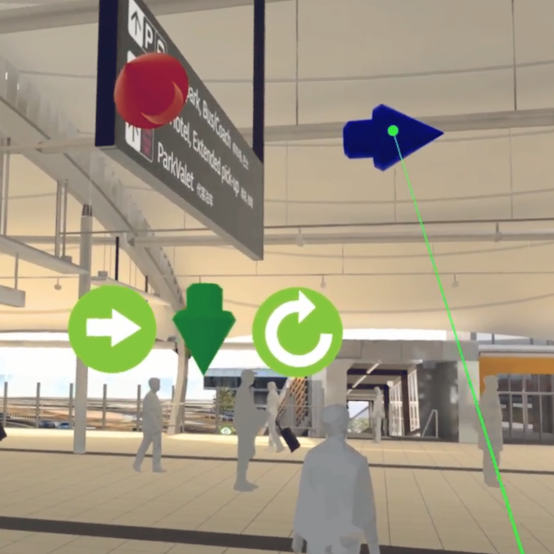
On top of a detailed 3D environment assembled by my coworker Brad Scott, we built out functionality to customise elements throughout the Skywalk. We added the ability to move and rotate signs, enable and disable environmental objects, and draw out mock walls and passengers. This functionality sounds eclectic at first, but came together to be something larger than the sum of its parts.
When we took clients through the model, we started them off in the typical passenger's journey. Placing them at the drop off zone, we told them to go through to the airport entrance. They ran through the passenger journey, where we'd call out signage and ask them whether it told them about all the things they needed to know. Then, we'd tell them about the functionality that we'd added, and allowed them to experiment. The client was able to try moving around signs, adding mock passengers to see the effects of a busy airport, adding mock hedges and visual baffles to discourage crossing at ground level. We even added an aspirational "Fast Access" passage from the Skywalk to the check-in zone of the airport, so the clients could imagine the alternative passenger journey.
This experiment had two effects. Firstly, the clients were able to understand the effects of the new signage from a passenger perspective, which is much more intuitive than looking at a signage report on a piece of paper. Secondly, by allowing the client to experiment and play with the project, we gave them a sense of ownership over the decisions made. This was a great outcome for us and for the stakeholders, and helped us work more closely with them in the future.
UX
This is one of the incomplete parts of the article. You can help by expanding it. If you're interested in VR UX, please do give me a shout. My details are in the header on this and every page.